 LeCoqRoti
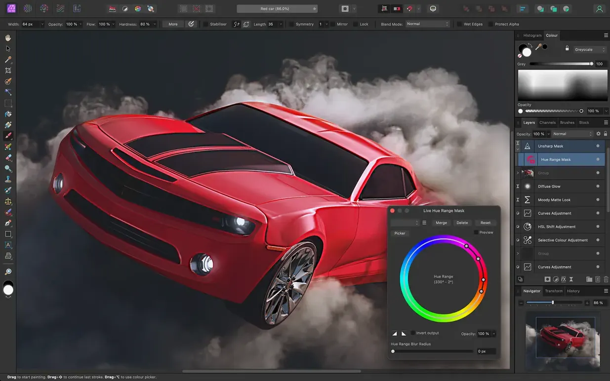
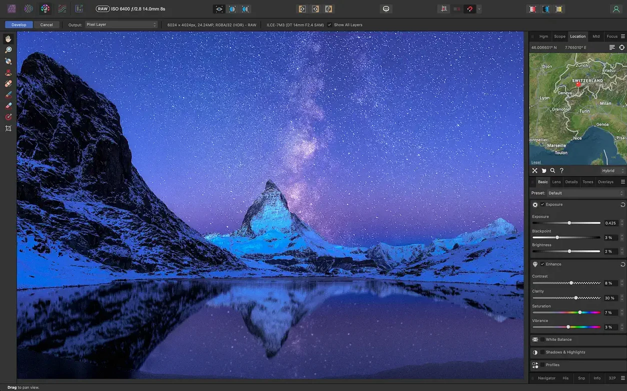
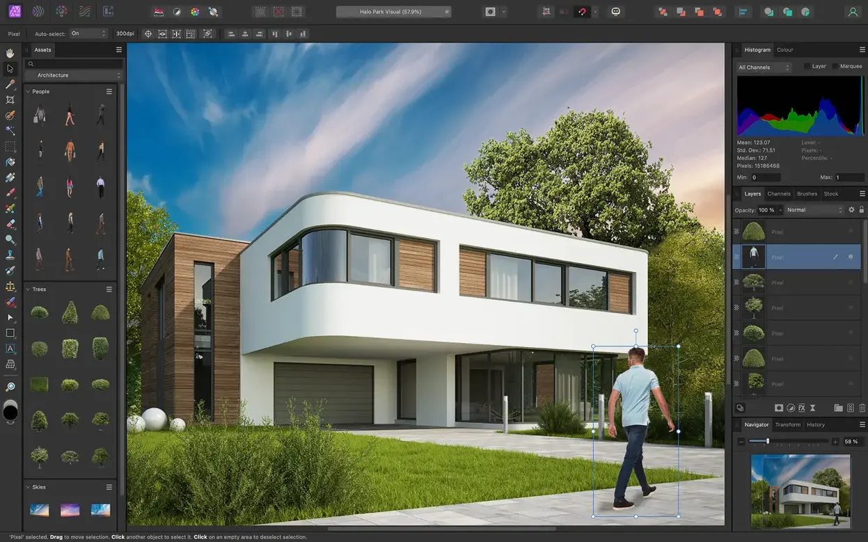
Opening a large layered file in a photo editor usually means waiting; most apps were built for a different era of computing. Affinity Photo starts from the opposite premise: work with huge images, unlimited layers and live adjustments, all without leaving the responsive feel of a modern Mac app.
Retouching: what makes the inpainting brush different
The inpainting brush analyses surrounding textures and tones so you can remove an unwanted object with a single stroke. It handles complex backgrounds more gracefully than a standard clone stamp, and because it works on a separate layer you keep the original intact.
RAW development: why the same engine runs the whole app
Switch from the Develop persona to the Photo persona and every adjustment stays live. Lens distortion, chromatic aberration and vignetting corrections applied to a RAW file remain editable after you move into layer-based editing — nothing is baked in until you choose to flatten.
Layer compositing: how live filters save time
Blur, tilt-shift, lighting and glow effects are applied as live filter layers that you can reorder, mask or toggle off at any moment. Combined with support for Photoshop PSD files, this makes it practical to exchange work with other tools without losing editability.
Automation: macros for repeated tasks
The macro recorder captures a sequence of edits and plays them back on a batch of images or a single layer stack. It is a quiet time-saver for studio work where the same colour grade or sharpening routine applies across a shoot.
Comparison: where it sits among Mac image editors
Three applications tend to come up in the same conversation as Affinity Photo: Adobe Photoshop, Pixelmator Pro, and the free RAW processor Darktable. They overlap in function but differ in philosophy, and the choice often hinges on what you value in a daily tool.
Photoshop remains the most feature-dense option, particularly for print production pipelines that rely on its smart objects, advanced colour management and scripting. Affinity Photo matches it in core retouching, layer compositing and PSD compatibility, yet feels lighter on system resources. Where Photoshop spreads its interface across floating panels you are expected to arrange yourself, Affinity uses a fixed persona system that switches the entire toolset for the task at hand — the trade-off is less customisation but a faster mental model once you learn the three or four personas you actually need.
Pixelmator Pro shares the same native-Mac spirit: quick to launch, tightly integrated with macOS colour pickers and Core ML for machine-learning features. Its machine-learning upscaling and automatic subject selection are genuinely useful, and its interface is the most approachable of the three. What it lacks is the depth of the layer stack Affinity offers. Live filter layers, nondestructive RAW round-tripping and full CMYK support are still Pixelmator’s weak points. If your work ends on screen, Pixelmator Pro may be enough; if it goes to print or passes through a studio pipeline, Affinity Photo covers more ground.
Darktable is the open-source dark horse — a dedicated RAW developer and photo librarian with parametric editing. It handles tethered shooting and has a passionate community, but its interface remains opaque to anyone who does not enjoy technical manuals. Affinity Photo’s Develop persona covers similar ground for single-image RAW work, while adding the entire photo-editing suite on the other side of the blue button.
Tablet, colour and scratch disks: pre-flight tweaks that prevent regret
A handful of preferences quietly shape how the application behaves with a graphics tablet, how colour is handled, and where temporary files land. Changing them early prevents frustration later.
- Performance — under Preferences, the RAM usage limit defaults to a conservative value. If you work with large composites or 16-bit files, raise it to at least 70% of your Mac’s available memory. The undo limit sits here too; 1024 steps is the ceiling and worth setting if you tend to experiment heavily.
- Colour — the RGB colour profile defaults to sRGB. Photographers printing through a lab or working alongside a design team should switch this to Adobe RGB or a custom profile before opening the first image. Changing it later does not retroactively assign the profile to existing documents.
- Tools — enable “Use Shift key to cycle tool groups” and “Use ⇧ and ⌥ to change brush size and hardness.” The latter lets you hold Control-Option and drag: left-right for size, up-down for hardness. It becomes second nature within a week.
- User Interface — the default grey background around the canvas is a mid-tone. Set it to a darker grey or black for colour-sensitive work; bright surroundings skew your perception of contrast and saturation.
- Tablet input — if you use a Wacom or similar tablet, switch Tablet Input Method to “High Precision” and test the pressure curve with a few strokes. The default curve works for illustrators but may feel too soft for retouching; a slightly steeper curve gives the dodge and burn tools more control.
Opacity by touch typing: the modifier shortcuts hidden in plain sight
Some of the most useful behaviour in Affinity Photo lives behind a modifier key or a right-click, invisible until you stumble across it.
- Quick opacity and flow — with the Brush tool active, tapping a digit key sets opacity (5 = 50%, 0 = 100%). Holding two digits in quick succession gives fine control: 4 then 3 sets 43%. The same works for the Flow parameter when you hold Shift with the number keys.
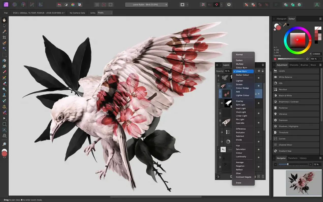
- Blend mode cycling — select a layer and press Shift–+ or Shift–− to cycle through blend modes. It is far faster than the drop-down when you are hunting for the right interaction between two layers.
- Solo mode for layers — Option-clicking a layer’s visibility icon isolates that layer, hiding all others. Option-click again to restore the previous visibility state. This works on groups as well.
- Mask from selection, instantly — after making any selection, press the Refine Mask button in the context toolbar or simply click the mask icon at the bottom of the Layers panel. No menu diving required.
- Clipping previews in curves — hold Option while dragging the black or white point slider in a Curves adjustment, and the canvas shows which pixels are clipping. Release the key to return to the normal view.
- Snapping candidates — the Snapping Manager includes a “candidates” list that lets you limit snapping to specific layers. Add your key alignment objects to the list and the canvas stays clean of unwanted snap points.
A specific task: frequency separation portrait retouch, end to end
Frequency separation splits an image into two layers: one for colour and tone (the low-frequency layer), another for texture and fine detail (the high-frequency layer). It is the standard method for smoothing skin without turning a face into plastic.
Start with a 16-bit TIFF or a developed RAW file. Duplicate the background layer twice. Name the lower duplicate “Colour” and the upper one “Texture.” Hide the Texture layer for a moment, select the Colour layer, and apply a Gaussian Blur from the Live Filters menu. Set the radius just high enough to soften skin pores and fine lines — 6 to 10 pixels for a portrait shot at close range. Confirm the filter.
Now reveal the Texture layer. With it selected, open Filters > Apply Image. Set the Source Layer to the Colour layer below, Channel to RGB, and Operation to Subtract. Offset 128. This extracts the fine detail the blur removed. Press Apply, then set the Texture layer’s blend mode to Linear Light. The image should look identical to the original — if it does not, check the blur radius or the Apply Image settings.
Group both layers and add a black mask to the group by Option-clicking the mask icon. Painting white onto this mask reveals the separation only where you brush. Work on the Colour layer with a soft brush and the Healing Brush tool to even out skin tone; use the Clone Stamp on the Texture layer to remove blemishes while preserving the skin’s natural grain. Vary the brush opacity to build the effect gradually. The mask confines every stroke to the areas that need attention, leaving eyes, hair and clothing untouched.
From flat RAW to layered portrait: half an hour with a city skyline
I open a RAW file shot in flat morning light — a portrait with a city skyline behind it. The Develop persona loads first: white balance drifts too cool, so I pull the temperature slider toward amber and lift the shadows half a stop to bring detail back into the jacket. Lens correction is already applied from the lens profile; I leave chromatic aberration removal on its default and click Develop.
In the Photo persona, the image sits on a single pixel layer. I duplicate it and use the Inpainting Brush on the duplicate to remove a street sign that cuts across the background. Three strokes, and the tool fills the gap with brick texture and window reflections that match the surrounding wall. I group the duplicate with the original and add a Curves adjustment layer above the group: a gentle S-curve for contrast, the black point checked with Option-drag to avoid clipping the jacket fabric.
A selective colour adjustment layer follows, targeting the red channel to pull a little magenta out of the skin tone. I invert the layer mask to black and paint white over the face with a soft brush at 20% flow, building the correction slowly. A second curves layer addresses the skyline alone — I mask it roughly, then refine the edge with the selection brush set to Snap to Edges.
Before finishing, I record a macro that applies a subtle high-pass sharpen and saves a full-resolution TIFF to a “finals” folder. The recording captures every step, including the save path. I play it once, check the output, and close the document with the edit history saved inside the .afphoto file — next week I can reopen it and see exactly which sliders were used.






Correspondence 0
Take a chair or join the table to send a letter.
No correspondence on this note yet. Letters are read before they appear.