 LeCoqRoti
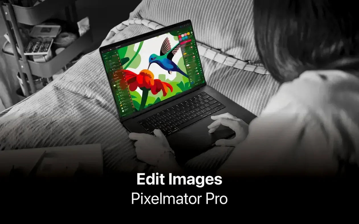
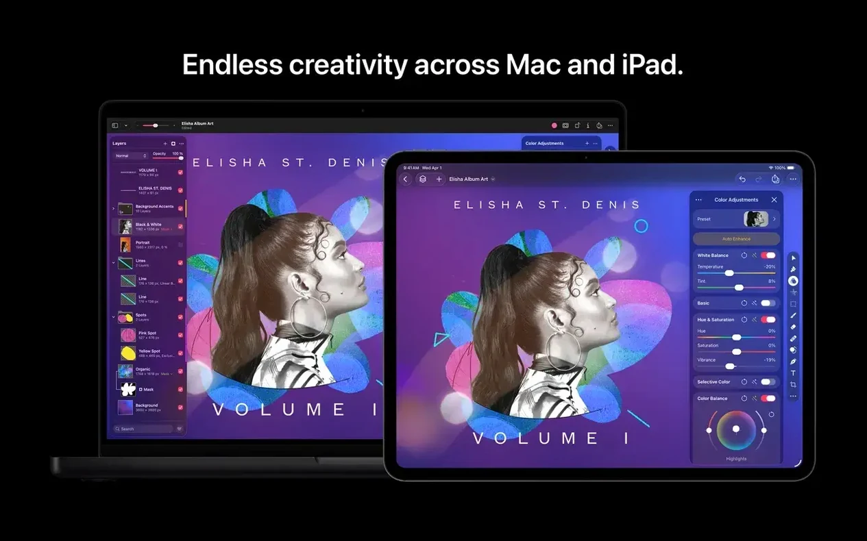
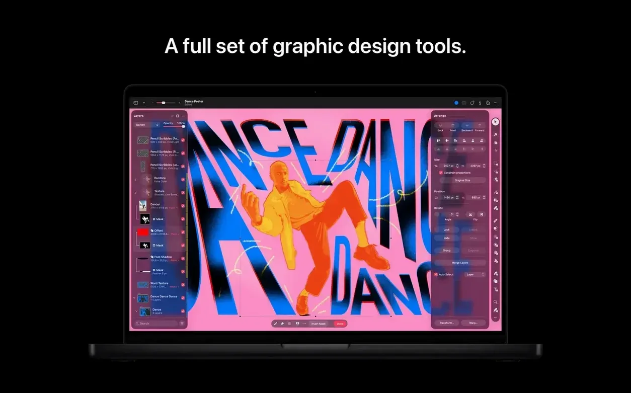
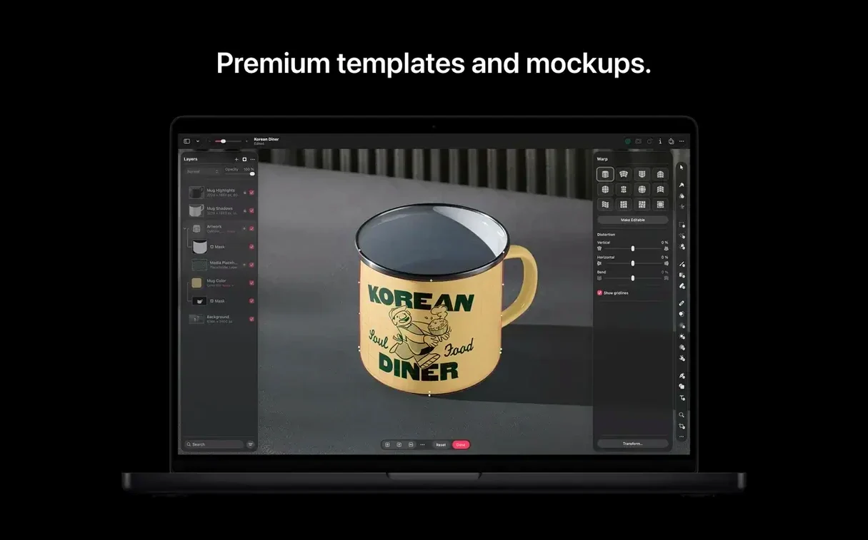
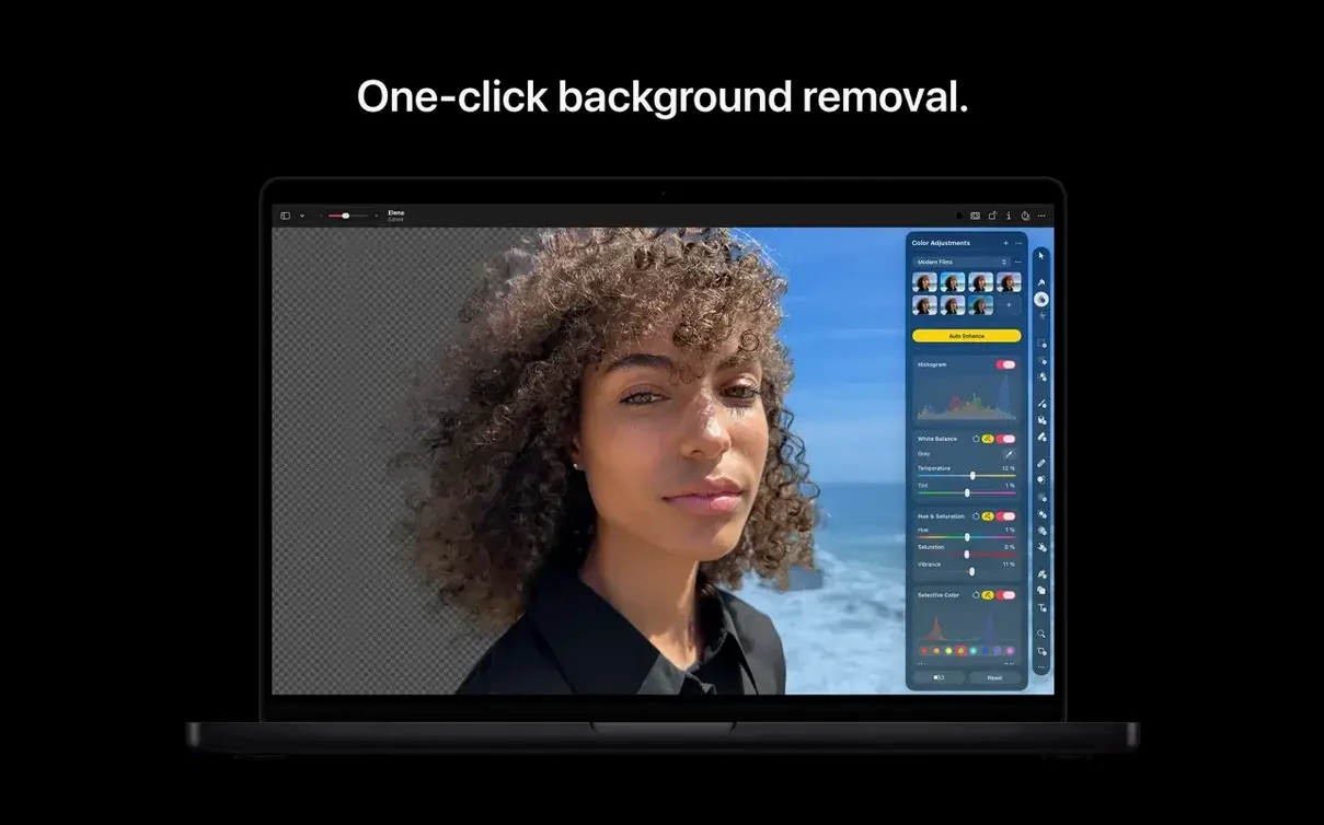
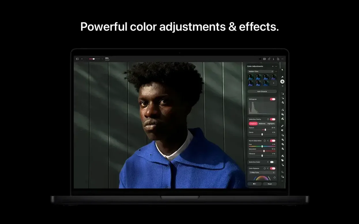
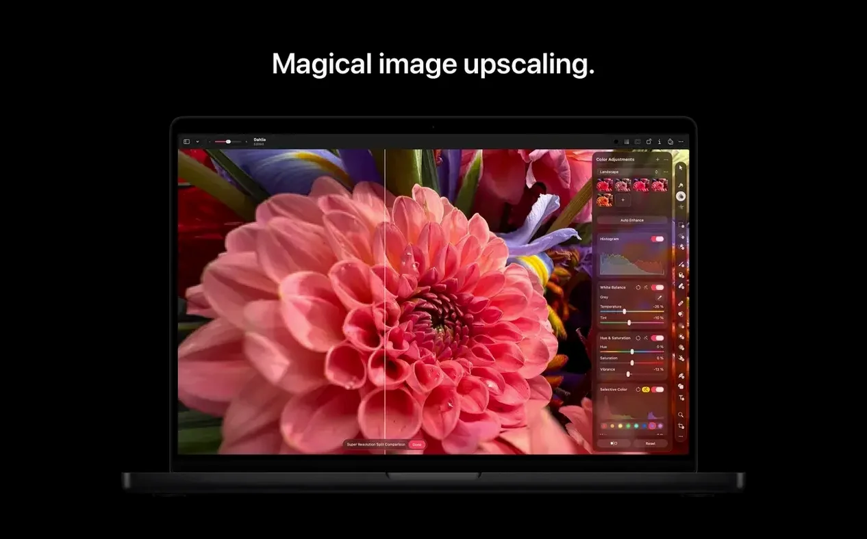
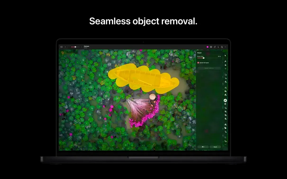
A photographer opens a raw file, adjusts the colour with a few sliders and then asks the app to remove a distracting object from the background — all in one window, without creating a single duplicate layer. That is the kind of session Pixelmator Pro is designed for.
What is Pixelmator Pro, exactly?
It is a layer-based image editor built for macOS, and it now lives inside Apple Creator Studio. Think of it as a workspace for everything from precise photo retouching to freeform illustration, with a toolset that includes non-destructive editing, SVG vector support and a repositioning tool for reshaping areas of an image.
Designers, photographers, and SVG wranglers: a wide arc of users
It suits a wide arc of users: designers who need to open and edit SVG files directly, photographers who rely on Core ML-powered enhancement instead of manual curves, and anyone who processes images in batches via Automator actions. The interface is dense but logical, rewarding familiarity.
What makes the current version different?
Version 4.3 leans into machine-assisted creation. You can generate custom vector shapes from a text description and use Generate from Image to transform existing work with written prompts. There is a strong through-line here: the machine handles the heavy lifting, but the results remain editable within the standard layer stack.
Adjustment layers vanish after cropping: understanding the stack
Layer behaviour is the first real hurdle. Someone imports a photo, applies adjustments via the Color Adjustments panel, then wonders why those changes vanish when they crop. The answer is usually a misunderstanding of the adjustment layer stack: adjustments applied through the Format menu land directly on the pixel layer, while those added through the Add Effect button sit as separate, re-orderable layers. If you want edits that survive cropping without resampling the original, drag your adjustment below the crop in the layer list.
Another frequent complaint is sluggish performance with large PSD files. The app reads Photoshop layers, but text layers with exotic fonts, certain layer styles and adjustment layers using legacy blending modes can slow rendering to a crawl. The quick fix: flatten any text layers you do not need to edit before opening the file. If you must preserve them, rasterise the type layers inside Photoshop first, then save a copy for Pixelmator Pro.
Export settings cause quiet frustration too. The default Quick Export preset may over-compress a high-contrast photograph. The solution lives in File > Export for Web, where you can preview compression artefacts at 100% zoom before committing. For lossless archival work, export as PNG or TIFF from the standard File > Export dialogue and check the Embed Color Profile box. Without it, images viewed in non-colour-managed browsers can drift noticeably warm.
Ninety minutes for a book cover composite: a session in Ikebukuro
It is late morning in Ikebukuro. A brief arrives from a small publisher: they need a book cover composite, built from three supplied photos and a rough sketch of the title placement. I have ninety minutes.
I launch the app and drag the hero photograph — a raw file from a Fujifilm camera — straight onto the canvas. The Raw Development layer appears automatically, and I lift the shadows by a half-stop while cooling the white balance slightly. I commit the raw settings and the image resolves into a standard layer, ready for retouching.
I switch to the Repair tool, option-click a clean patch of sky and paint over a telegraph wire. The clone source follows intelligently, and two passes clean the wire without smearing cloud detail. Next, I open the second photo on a new layer, set its blend mode to Multiply and add a layer mask. A soft black brush at 20% opacity blends the texture into the background, leaving just enough grain to feel organic. The third image — a hand-drawn illustration — arrives as a flat JPEG. I use the Select Subject command, which isolates the inked figure in under a second. A one-pixel feather on the selection softens the edge, and I place the figure on the left third of the composition.
Now the vector work. I choose the Pen tool, plot a gentle curve for the title path, then switch to the Type tool. Clicking the path turns it into a text guide; I type the title in Baskerville, adjust the tracking to +40 and set the fill to a warm ivory sampled from the sky. A subtle outer glow — 2% opacity, large radius — lifts the lettering just enough to separate it from the busy background.
Before sending, I open File > Export for Web, zoom to 200% and pan across the darkest areas. The compression preview reveals faint blocking in the Multiply layer; I raise the quality slider two notches, check again, then export. The final PNG is under 4 MB and clean at print resolution. I close the app without saving the layered file; the publisher only needs the flat composited image. The whole session took seventy minutes.
Where it fits among Mac image editors: a landscape view
Pixelmator Pro and Acorn
Acorn, from Flying Meat, shares a similar philosophy: a fast, native Mac image editor that does not try to clone Photoshop wholesale. Where they diverge is in their approach to non-destructive work. Acorn leans on its filter chain system, which is elegant and linear, while Pixelmator Pro spreads adjustments across a more Photoshop-like layer stack. For a quick web graphic with three filters, Acorn feels faster. For a composite with a dozen masked layers, twelve type elements and a raw development stage, Pixelmator Pro offers more headroom before the file becomes unwieldy. Acorn’s vector tools are rudimentary; Pixelmator Pro handles SVG import and export with proper path editing, which matters if logos or icons cross your desk regularly.
Pixelmator Pro and Affinity Photo
Affinity Photo is the heavyweight in this bracket: full CMYK support, live liquify, frequency separation built into the interface, and a deep set of print-production tools. Pixelmator Pro does not attempt to match that print-focused feature set. What it does better is feel like a Mac application. Affinity Photo’s interface, powerful as it is, carries a certain ported-from-Windows weight. Pixelmator Pro uses Core ML for its enhancement engine, leans on the Photos library integration, and the new Content Hub and Generate Image tools feel native to the Apple ecosystem in a way Affinity’s equivalent automation features do not. For a photographer who prints fine-art work with custom ICC profiles, Affinity is the more complete tool. For someone editing images destined for screens, who values fast raw development, quick retouching and machine-assisted vector generation, Pixelmator Pro is often the more direct route.
Pixelmator Pro and Adobe Photoshop
This is a comparison people make when searching for a pixelmator pro mac full alternative to a Photoshop subscription. The gap has narrowed over the years, but it is still real. Photoshop’s typography engine, its scripting depth and its plug-in ecosystem remain in a different league. Pixelmator Pro does not run Photoshop plug-ins and does not offer a scripting API. What it offers is a lighter footprint, a single-window interface that does not scatter palettes across two displays, and a render engine that feels snappier on Apple silicon for common tasks. For a retoucher who needs frequency separation, custom brushes and actions, Photoshop is still the reference. For a designer who builds composites, touches up photos and occasionally needs to open or export a PSD without converting every layer, Pixelmator Pro handles the job without the overhead.
Mistakes beginners make, quietly
One I see often: treating the Repair tool like a content-aware brush with no preparation. People paint long, continuous strokes over complex areas — a face with hair crossing it, for instance — and then wonder why the result looks like melted plastic. The Repair tool works best with short, deliberate strokes, and you should resample the source point every few centimetres. If the area is genuinely complex, switch to the Clone Stamp and use a soft brush at 60% opacity; it takes longer but leaves you in control.
Another common misstep is ignoring colour profiles at the import stage. A designer opens a file from a client, edits for an hour, exports, and the reds look orange on the client’s screen. The culprit is usually a mismatch: the file arrived in Adobe RGB, the app is working in Display P3, and the export stripped the profile. Before you begin any colour-critical work, open View > Proof Colors and set the proof profile to sRGB if the destination is a website, or to the printer’s profile if it is going to press. It takes ten seconds and prevents a world of rework.
Beginners also tend to stack every adjustment as a separate effect layer when a simple Format > Color Adjustments pass would do. Non-destructive editing does not mean every tweak deserves its own layer; it means you should preserve the option to go back. A single Color Adjustments layer with changes to exposure, contrast and white balance is easier to fine-tune than three separate layers that interact unpredictably when you reorder them later. Use the fewest layers that express your intention clearly.
Finally, people importing a full Pixelmator Pro torrent download sometimes launch the app and immediately open a 600 MB PSD without checking available memory. On a Mac with 8 GB of RAM, that file plus a few generated-image layers will push the system into swap territory. If you work with large canvases regularly, close other heavy apps and consider flattening any PSD layers you do not intend to edit. The app handles itself well, but it cannot rewrite the laws of RAM.
A workflow: cleaning and preparing product photography for an online shop
Imagine a small ceramics studio. They have photographed forty mugs on a wooden table under mixed light — some daylight from a window, some warm ceiling spots. The images need to look consistent, the backgrounds need to disappear and each file must be cropped square and exported at 2048 pixels wide.
Step 1: Batch white balance
Open the first raw file. The window light has left a blue cast on the left side of the mug. Use the White Balance tool, click the eye-dropper on a neutral grey area of the table and warm the image until the glaze reads as the correct cream colour. Note the temperature and tint values, then close the file. Open File > Automate > Batch Process, select the folder of raw files, apply the same white balance values and output as 16-bit TIFF files to a new folder. This takes under a minute.
Step 2: Background removal
Open the first TIFF. Choose the Select Subject command. The mug isolates cleanly against the wooden table; the algorithm handles the subtle shadow at the base well. Refine the selection edge by 0.5 pixels and contract by 1 pixel to avoid a halo. Invert the selection and press delete. The background is now transparent. Save the file as a layered Pixelmator Pro document so the mask remains editable.
Step 3: Consistent framing and cropping
With the mug on a transparent background, select the Crop tool and set the ratio to 1:1. Drag the crop square so the mug sits centrally with equal breathing room on all sides. For taller mugs, adjust the vertical position slightly — no need to crop off the handle. Commit the crop.
Step 4: Clean-up and retouching
Zoom to 200% and scan for dust on the glaze or small reflections that distract. Use the Repair tool with a 15-pixel soft brush to tap away three specks of dust. One mug has a small chip on the rim; the Clone Stamp at 80% opacity, sourced from an intact section of the rim, hides it cleanly. The edit is subtle enough that it does not misrepresent the product; the studio owner approved this level of retouching beforehand.
Step 5: Shadow and final colour check
Add a new layer beneath the mug, select a soft black brush at 10% opacity and paint a gentle oval shadow. Set the layer blend mode to Multiply and reduce opacity until the shadow looks natural against the expected white web background. Turn on View > Proof Colors with sRGB selected, check that the glaze colour holds, and make a tiny curves adjustment to lift the mid-tones slightly for screen viewing.
Step 6: Export
Open File > Export for Web. Set the format to PNG, the width to 2048 pixels, and the quality slider to maximum. Enable Embed Color Profile and ensure the output is set to sRGB. Export the file with a clean product-code filename, then repeat for the remaining mugs. Each subsequent image takes roughly three minutes, because the subject isolation and cropping become muscle memory.
The batch white balance alone saved an hour of manual correction, and the Select Subject command turned what used to be a pen-tool marathon into a few clicks. The studio receives forty clean, colour-consistent product images, ready for their Shopify catalogue, all produced without leaving a single application.






Correspondence 0
Take a chair or join the table to send a letter.
No correspondence on this note yet. Letters are read before they appear.