 LeCoqRoti
Compatibility: Intel Macs running Big Sur or later
Drama requires macOS 11.5 and an Intel processor. It does not, at present, run natively on Apple Silicon — Rosetta 2 handles the translation. The interface is English only.
Good for
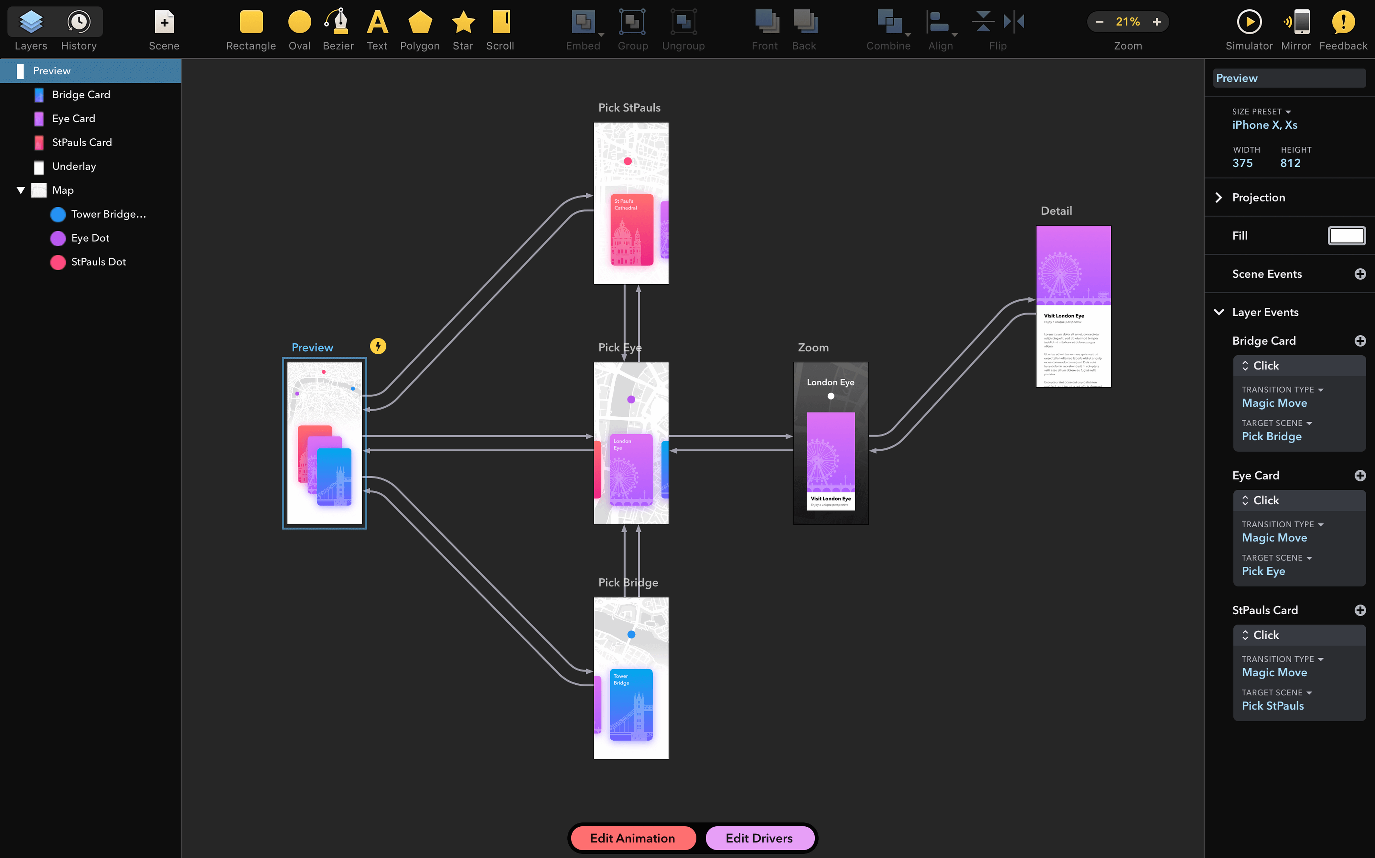
- Prototyping: building tappable interface mockups without leaving the tool.
- Animation: creating motion sequences for interface elements or standalone animated pieces.
- Design: vector drawing and layout work, with a single canvas for all three tasks.
- Consolidation: replacing separate design, prototyping and animation applications with one 3-in-1 workspace from the makers of PaintCode.
Keep in mind
- No Apple Silicon native build is available yet.
- The interface is English-only, with no localisations listed.
- A crash linked to specific installed fonts was addressed in version 2.1.4, though font-related stability questions sometimes reappear after system updates.
Who benefits most: a few user profiles
Drama makes the most sense for someone who touches interface design, motion, and interaction in roughly equal measure. A pure vector illustrator will find the drawing tools comfortable but underused; a full-time animator may miss timeline complexity. The sweet spot sits with the generalist.
The solo product designer. One person mapping flows, drawing screens, and animating transitions — all without switching apps. Drama’s single canvas means a button can be designed, then animated, then linked to another artboard in minutes. No export–import dance.
The prototyping-heavy team. When a designer needs to communicate a micro-interaction to developers, a quick tappable prototype with animated feedback carries more weight than a deck of static mockups. Drama produces something clickable that still feels like design, not engineering.
The educator or design student. Learning three separate tools for design, animation, and prototyping is expensive and cognitively heavy. A single environment lowers the barrier enough that someone can explore motion and interaction earlier in their training.
It is less suited to print designers (no CMYK, no pre-press features) and to teams deep in a Figma or Sketch ecosystem where collaboration and handoff are the primary concern. Drama works best when the same person owns more of the creative chain.
A small task, end to end: animated onboarding card
Imagine a mobile onboarding screen: three illustrated cards, each with a heading, a short paragraph, and a stylised icon. The brief calls for a subtle entrance animation where each card fades and slides up in sequence, then remains tappable to advance.
First, the designer creates an artboard at 390 × 844 points. Three card groups are drawn on separate layers using Drama’s vector tools — rounded rectangles, text frames, and imported SVG icons. Layer naming happens early: card-01, card-02, card-03. Good names prevent confusion later when linking interactions.
With the static design in place, the designer switches to the animation timeline. Each card group receives two keyframed properties: opacity (from 0 to 1) and Y position (shifted up 24 pixels, then back to zero). The first card begins at 0.0 seconds, the second at 0.3 seconds, the third at 0.6 seconds — a staggered fade that reads as one fluid thought. Easing curves are set to something gentle; the default ease-out often does the job without tweaking.
Finally, the prototyping mode links the artboard to itself on tap, cycling through a state that reveals the next card. A quick preview on a connected device confirms the timing feels natural, not sluggish. The entire sequence — design, animation, interaction — lived inside one file, on one canvas, without exporting assets to another tool.
Common beginner mistakes
Diving straight into animation without layer structure. Drama’s timeline maps to layers. If everything sits on one flat layer, animating individual elements becomes impossible. New users benefit from spending five minutes naming and grouping before touching a keyframe. A messy layer list is the fastest route to a tangled project.
Over-animating. Because the timeline is accessible, there is a temptation to animate every element — buttons bobbing, text sliding, icons spinning. Restraint builds better prototypes. One motion per component, with a clear purpose, reads as polished. Three simultaneous movements on one card reads as noise.
Ignoring easing. Linear motion looks mechanical. Drama provides easing curves, but beginners often leave everything at the default linear setting. A few seconds spent choosing an ease-out curve for entrance animations and an ease-in for exits makes the prototype feel considered rather than programmed.
Forgetting to test on a device. What looks smooth on a 27-inch display can feel sluggish or cramped when tapped on a phone. Drama’s preview feature bridges the gap, and new users who skip it miss timing problems that only surface in the hand.
Expecting a code handoff. Drama generates prototypes, not production code. Beginners coming from tools with developer-handoff modes may assume CSS or Swift output exists; it does not. The export is the prototype itself, meant for review and demonstration rather than engineering handover.
What recent versions changed in daily work
Version 2.1.4 is a maintenance release, but the fix it delivers matters in practice. A specific category of installed fonts could cause the application to crash on launch, without a clear error message. When the app fails silently before the canvas appears, the natural response is to reinstall, to restart, and eventually to suspect the system. The font-handling patch removes a subtle, frustrating obstacle — the kind that wastes an afternoon and eats confidence in a tool.
Earlier in the 2.1 cycle, the focus had been on stability under macOS Monterey and Ventura, particularly around Metal rendering and window compositing. Users who had seen visual glitches during animation playback — flickering artboards, incomplete redraws — found those largely resolved. The rendering improvements were not flashy enough for a feature list, but they quietly changed the feel of the timeline: scrubbing became smoother, preview frames stopped dropping.
The Gatekeeper-friendly packaging, introduced before 2.1.4, also shifted the first-run experience. Where earlier versions required a manual bypass through System Preferences, the disk image now prompts a single Terminal confirmation. It is a small detail, but one that reduces friction on the very first interaction with the app — important for a tool that asks users to commit to a new workflow.
In short: the last few updates have not added headline features. They have removed papercuts. The app opens more reliably, plays animations more smoothly, and installs with less system resistance than it did a year ago.






Correspondence 0
Take a chair or join the table to send a letter.
No correspondence on this note yet. Letters are read before they appear.