 LeCoqRoti
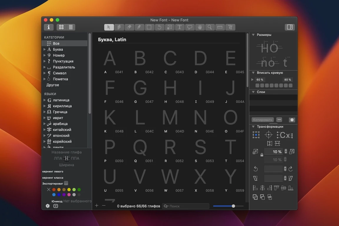
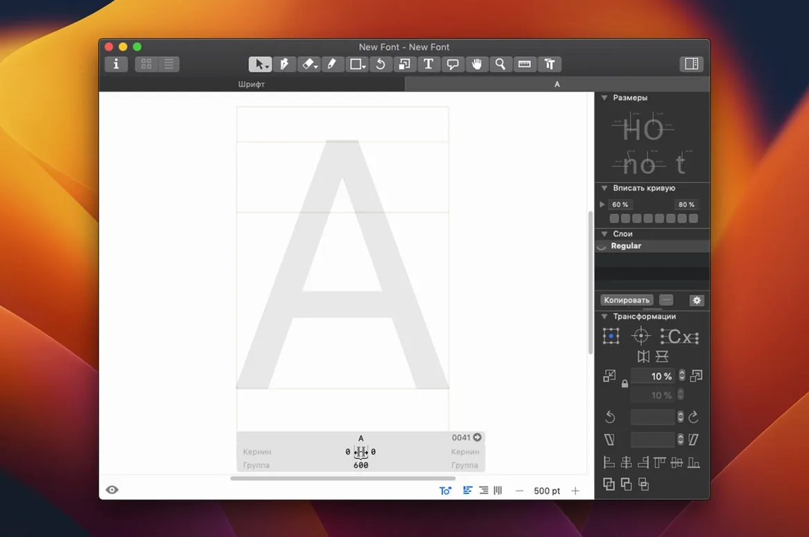
Most Mac users open Font Book and see a collection of system faces. Glyphs takes the step beyond that catalogue: it is the drawing board where those typefaces are born. Moving from browsing to building is a shift in perspective, and a few deliberate first actions make the transition feel natural.
Drawing: the pen tool rethought
Start in a blank glyph cell by pressing the P key. The vector drawing here follows Bézier logic familiar from Illustrator, yet the feedback is tuned for type — points snap to a fine grid and stem weights preview in real time. Draw a simple ‘O’ first; the curve feels more patient than a general illustration tool.
Scripts: automating the repetitive
Open the Scripts menu and run the built-in script that generates accented characters from a base glyph. Watching é, è, and ê appear from a single ‘e’ reveals how the app thinks about construction. Python-based extensions, accessible through the Extensions module, let you add custom routines later.
Export: a first .otf test
After drawing a handful of letters, go to File > Export and choose OpenType. The resulting .otf file can be installed in Font Book and tried in TextEdit immediately. Seeing your shapes set real words — however rough — closes the loop between editor and page.
Comparisons: where Glyphs sits among Mac font editors
Type designers often arrive at Glyphs after time spent in FontForge or RoboFont, and the differences in working rhythm become clear within an hour. FontForge approaches the task with a programmer's directness; its panels are dense with controls and the drawing canvas presumes you already know where everything lives. Glyphs reduces that visual noise considerably, keeping the glyph window calm and letting the vector points dominate. The cost is that some deep technical options sit one menu further away than FontForge veterans might expect.
RoboFont shares Glyphs' scripting spirit and also runs natively on Apple Silicon, yet RoboFont leans harder into a blank-canvas philosophy: nearly every convenience must be added as an extension. Glyphs ships with more of the daily workflow already assembled — spacing controls, component handling, automatic accent generation. A designer who wants a tool that is ready after installation will notice the difference. Those who enjoy assembling a personal toolkit may prefer RoboFont's openness. Neither approach is wrong; they answer different temperaments.
Workflow: drawing a display face from sketch to test
Here is a concrete path that suits the first real project, a single-weight display face with perhaps forty glyphs.
- Set the dimensions. Create a new document and define ascender, descender, and x-height in the Font Info panel. For a display face, generous ascenders help the letters feel airy at large sizes.
- Draw the control letters first. Begin with
nando, notaorg. These two shapes determine most of the rhythm. Keep thenstems consistent and let theocurves breathe. - Build components. Turn the
ninto a component, then use it inmandh. When you adjust the source, the derivatives follow. This is where Glyphs' component logic saves real hours. - Generate the remaining lowercase. Work through
a,e,s— the difficult ones — with the drawing tools you already know. Use the measurement line to check stem widths against then. - Run an accent script. From the Scripts menu, generate accented glyphs from your base letters. Check the positioning; adjust anchors if an acute sits too far left.
- Export and test. Export an .otf, install it in Font Book, then set a paragraph in TextEdit at 48 points. Print it. Screen alone hides spacing problems.
This loop — draw, generate, export, test — becomes the natural rhythm after a few sessions.
Redraw complex glyphs without hesitation: speed on Apple Silicon
On Apple Silicon, Glyphs launches quickly and redraws complex glyphs without hesitation. The interface stays responsive while editing a font with several hundred glyphs open; panning and zooming in the glyph window feel immediate. Intel Macs run the app acceptably, though large projects with many open tabs benefit from the newer architecture.
Memory use remains moderate for a vector editor — a typical working file with a full Latin set occupies a fraction of what a comparable InDesign document demands. The app does not phone home or load unnecessary services, which keeps background activity low. Stability has been solid through long drawing sessions; the autosave is quiet, and crashes are rare enough not to shape the daily experience. Exporting a full OTF with hinting and features completes in seconds, not minutes.
Learn the Show Glyphs panel early: type adieresis to jump
- Learn the Show Glyphs panel early. It is the quickest way to move between letters, and the search field understands names like
adieresisoruni00E9. - Set up a testing paragraph. Keep a TextEdit file with pangrams and your working font installed. Update it after each export; the loop feels less abstract when you see real words change.
- Use the measurement line. Turn it on while drawing to keep stem widths honest. A display face can tolerate optical corrections, but the line keeps you aware of them.
- Name your glyphs deliberately. Good naming now —
a.sc,g.ss01— prevents confusion when the font grows beyond the basic Latin set. - Back up the .glyphs file. It is a small text-based format, which makes version control easy. Even a simple
cpcommand at the end of a session is enough.




Correspondence 0
Take a chair or join the table to send a letter.
No correspondence on this note yet. Letters are read before they appear.