 LeCoqRoti
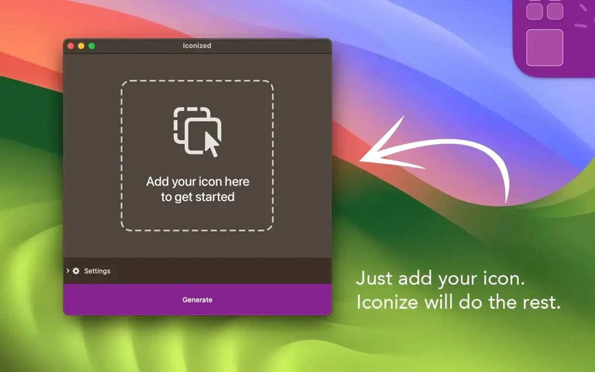
Many Mac users know the manual ritual: find an image, open it in Preview, copy the contents, return to the Finder’s Get Info panel, and paste over the tiny icon thumbnail. Iconize collapses that sequence into a single drag-and-drop gesture. It sits alongside your existing image browser or Finder workflow, handling the conversion step for apps, folders and plain files without fuss.
Visual overhaul for project folders and Dock apps
- A clean visual overhaul of a project folder or a set of frequently used folders
- Giving sideloaded or niche utilities a recognisable Dock presence
- Quickly testing icon designs on a live desktop before committing to a final export
English-only interface with external image prep
- The interface language is English only, which may matter for non‑English-speaking environments
- It is a focused utility, not a full icon editor: you prepare the image elsewhere and Iconize applies it
A compact workflow: turning a sketch into a folder icon
Let me walk through a concrete example. I keep a folder called Prints on my desktop for print‑ready PDFs that go to the studio’s colour laser. It has looked dull since 2019. The other day I sketched a small cyan‑and‑magenta glyph in Sketch, exported it as a PNG at 1024 × 1024, and decided to apply it with Iconize.
- Dragged the PNG from Finder straight onto the Iconize window — no need to open Preview or think about format conversion. The app accepts anything ImageIO can read, so a JPEG, HEIC or even a TIFF would work identically.
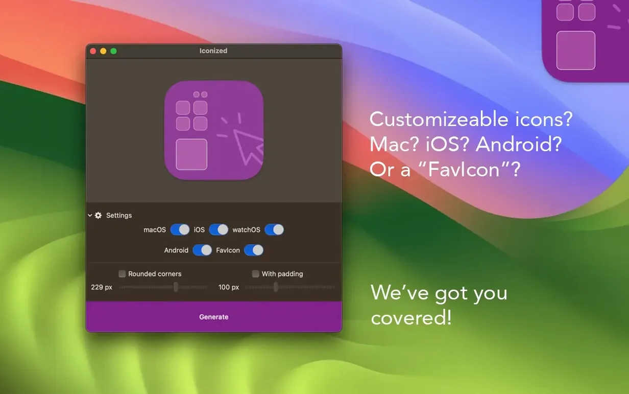
- Clicked the Rounded corners checkbox to match the system’s slightly softer silhouette on Big Sur and later. Left the slider at its default of about 18 %, which feels close to Apple’s own app icon radius.
- Pulled the Padding slider to around 12 % — enough to give the glyph breathing room without shrinking it into illegibility on a small sidebar view.
- Dragged the Prints folder from the desktop directly onto the target area at the bottom of the window. Iconize applied the new icon instantly, bypassing the Get Info panel entirely.
The whole sequence took perhaps forty seconds, and most of that was deciding whether the padding felt right. The app does not touch the original image file, so the PNG remains untouched and editable if I want to tweak the glyph later. One detail worth noting: if you drag a folder from a network volume, the effect is just as quick, though you will need write permission on that share for the change to stick.
Preparing images elsewhere: a smoother daily routine
After installing Iconize, a few small practices make the tool feel more natural in daily use. They are not hidden features — just patterns that emerged after a week or two of fitting it into a real desktop routine.
- Keep a “source” folder for icon images. I now store icon artwork in a single directory called IconAssets inside Documents. Having PNGs and JPEGs collected in one place means Iconize always has something to drag from without hunting through scattered project folders.
- Use the padding slider before dragging the target. The app’s preview updates as you adjust the two sliders, so setting padding and corner radius first — before you commit the icon — saves an undo cycle. You can drag the target at any point; the order is flexible, but preview‑first feels more deliberate.
- Restore a standard folder icon with one click. If you over‑customise and want the original blue folder back, simply drag the folder onto Iconize while the image well is empty. It reverts to the system default immediately. I learned this after getting a little too enthusiastic with a neon‑green experiment.
- Pin the app to the Dock for a day or two. Iconize is light enough to keep running, but pinning it during that initial burst of customisation makes the drag‑and‑drop habit stick. After a week, muscle memory takes over and you can unpin it.
If you work on an Apple Silicon Mac, the app launches as a native process — no Rosetta translation — so the interface keeps up with rapid drags even when you are re‑iconing a dozen folders in quick succession. The same holds on Intel machines, where the footprint stays modest.
Turning a messy client folder into a colour-coded set
Yesterday afternoon I sat down to tidy a client project folder that had grown messy over three months. The folder held subdirectories for briefs, drafts, exported PDFs and archived correspondence, all wearing identical blue‑grey folder icons. I wanted to give each a custom colour marker and a small letterform so I could spot them instantly in column view.
I opened Iconize and left it floating to the left of a Finder window. The source images were already prepared: four simple JPEGs — a red ‘B’, a green ‘D’, an orange ‘E’ and a grey ‘A’ — each 512 × 512 on a white background, exported from Figma the night before. No need to convert them to ICNS; Iconize handles that internally.
I dragged the red ‘B’ JPEG into the app. The preview showed it immediately, and I nudged the corner‑radius slider to about 20 % so it would read as an app‑style icon rather than a raw square. Padding stayed at 10 %. Then I grabbed the Briefs folder from Finder and dropped it onto the target zone. The folder refreshed in place; I watched its icon flip to the red letterform in real time, both in the Finder window and in the sidebar of an already‑open document panel.
The same three‑drag sequence repeated for Drafts, Exports and Archive: JPEG into Iconize, tweak the radius if needed, folder onto the target. Each one took less than ten seconds. By the end, the project directory read like a colour‑coded index — something that would have taken twenty minutes with the manual Preview‑copy‑paste method. I closed Iconize, reopened the folder in list view, and could navigate entirely by colour without squinting at folder names. A small thing, but it cuts down on that







Correspondence 0
Take a chair or join the table to send a letter.
No correspondence on this note yet. Letters are read before they appear.