 LeCoqRoti
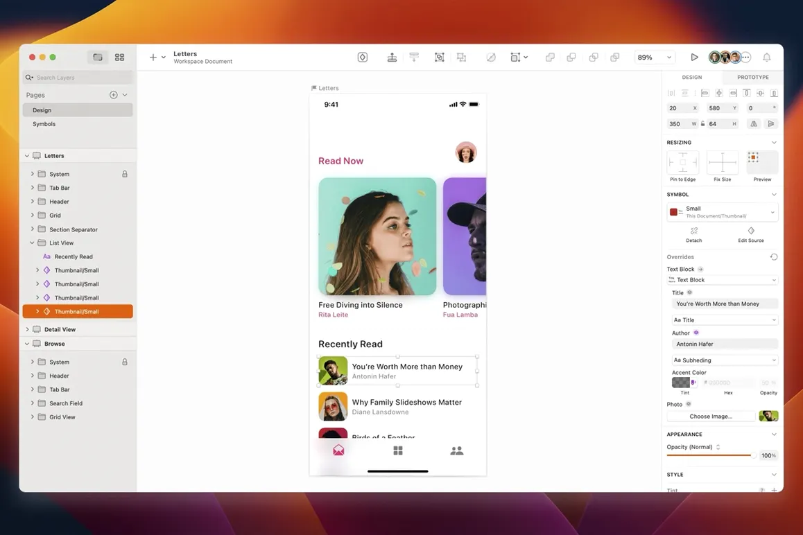
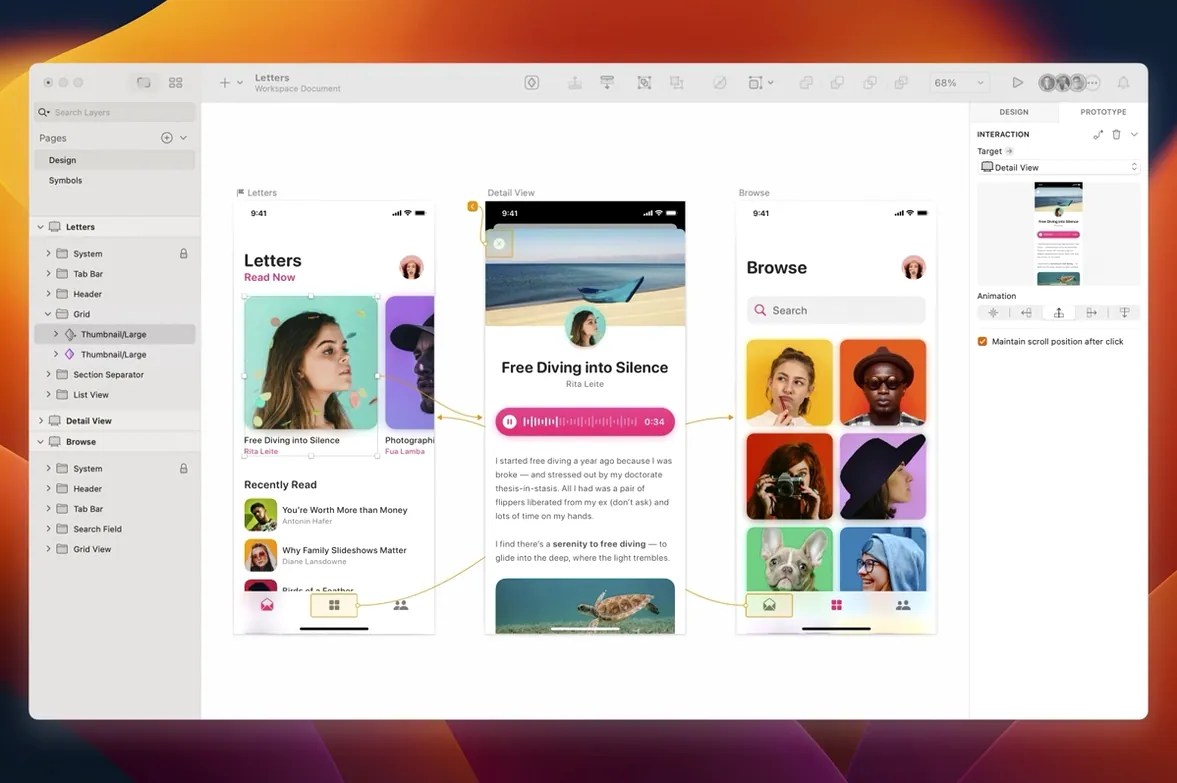
Translating an interface idea into a set of production-ready assets usually means patching together several tools. Sketch keeps that entire flow inside one native Mac application, from the first rough wireframe through to developer handoff.
Wireframing: speed over polish
The vector engine lets you block out screen layouts quickly, without fighting tool palettes. Symbols and resizing rules stay active even at this early stage, so a rough layout can evolve into a full design system without a rebuild.
Prototyping: the screen as a sequence
Artboards link together with simple hotspots, turning static layouts into a walkable prototype. The integration with collaboration apps means stakeholders can comment directly on the flow, keeping feedback tied to the right screen.
Export: production values
Slice and export tools handle the final step, outputting assets at the resolutions and formats a development team expects. Everything stays vector-crisp until the moment of export, so last-minute scaling changes do not force a re-render from scratch.
Common beginner missteps: a few paths worth avoiding
New users often treat Sketch as a generic drawing canvas and ignore the structure it offers. They create a single page with dozens of artboards representing wildly different screens — mobile, desktop, tablet — all jumbled together. Pages exist for a reason: they keep platforms or flows cleanly separated, and the layer list stays manageable.
Another early habit is overusing groups instead of Symbols. A button repeated across twenty artboards, manually grouped and copied, becomes a maintenance burden the moment the client asks for a different corner radius. Converting that group into a Symbol takes seconds and pays back hours. Beginners also overlook the resizing controls in the Inspector: a Symbol that looks correct on an iPhone-sized artboard may float awkwardly on an iPad variant if the pinning rules were never set. A quick check with the preview tool reveals the problem before it reaches a prototype review.
Text styles are similarly neglected. Setting font, weight, and colour by hand for every label feels productive at first, but a single design system change later forces a tedious hunt across every artboard. Defining a handful of text styles early — even just Heading, Body, and Caption — turns a half-day correction into a two-minute edit.
Your first days: a quiet setup routine
After installation, resist the urge to start a live project immediately. Spend half an hour inside an empty document to adjust a few preferences that shape the entire experience. The canvas zoom behaviour and nudge amounts — found under Sketch > Settings > Canvas — are worth dialling in: a nudge of 1 px with a 10 px shift-nudge suits screen work for most people, but designers moving from other tools often prefer slightly different values.
Open the Components view early and treat it as a workspace, not a library tab. Dragging a colour or a text style onto an object from the Components panel feels indirect at first, but the speed becomes apparent once a design system grows beyond a handful of elements. The first Symbol you create — perhaps a simple status bar or a navigation item — is less about the graphic itself and more about learning how overrides work. Insert an instance, change its label via the overrides panel in the Inspector, and watch the master remain untouched. That single interaction clarifies more than a tutorial video ever does.
Also, map out the plugin landscape lightly at the start. The community produces an enormous range, but installing too many plugins before you have a sense of the native toolset clouds the learning process. One or two well-chosen additions — a content generator for placeholder text and avatars, for example — are enough for the first week.
Medium project loads in under five seconds: canvas stays fluid
In daily use across an Apple Silicon machine, Sketch loads a medium-sized project — thirty artboards, a few hundred Symbols — in under five seconds. Canvas zooming and panning stay fluid even with layer-heavy artboards, something the native Metal rendering handles without the fans spinning up. The memory footprint hovers modestly: a typical UI project with multiple pages and embedded bitmap assets rarely pushes past 600 MB of RAM, leaving generous headroom for other apps.
Stability in version 2026.3.1 is uneventful in the best sense. A full workday of switching between the vector tool, prototyping mode, and the Components view produces no crashes, and the autosave recovery has proven itself reliable after a forced Mac restart. The only perceptible pause occurs when running a complex plugin that processes hundreds of layers, and even then the beach ball lasts a few seconds at most. Quitting and relaunching the application is fast enough that it becomes a non-decision — something you do without thinking when you need a clean state.
A task, step by step: designing a login screen
Consider a simple mobile login screen, built from an empty artboard to a componentised layout.
Artboard and grid. Press A and select an iPhone-sized preset from the Inspector. Set a layout grid with centre-aligned columns and a comfortable gutter, then lock the grid visibility. The constraint is intentional: the screen must feel balanced within a defined rhythm.
Type styles first. Before drawing any shape, define two text styles — a large title style and a smaller body style with reduced opacity for the secondary label. Name them clearly in the Components view. This small act shapes every decision that follows.
Input fields as Symbols. Draw one text field: a rounded rectangle, a placeholder text layer, and an icon on the left. Convert it to a Symbol and expose the placeholder text as an override. Insert two instances — one for the email field, one for the password field — and align them vertically using the Smart Guides.
The button. Create a wide filled button Symbol with centred label text. The resizing options in the Inspector should pin it horizontally to both edges of its parent, so the same Symbol works on wider artboards without breaking. Insert it below the password field.
States. Duplicate the artboard twice. On the second artboard, type realistic placeholder data into the overrides. On the third, toggle the button label to a disabled state. The prototype flow, linked with simple hotspots, now shows an entry screen, a filled screen, and a paused state. Export the button asset as an SVG slice for the developer, and the entire artboard set remains editable for the next iteration.






Correspondence 0
Take a chair or join the table to send a letter.
No correspondence on this note yet. Letters are read before they appear.