 LeCoqRoti
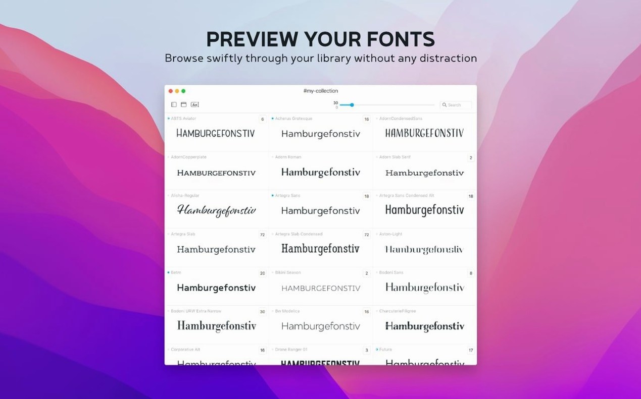
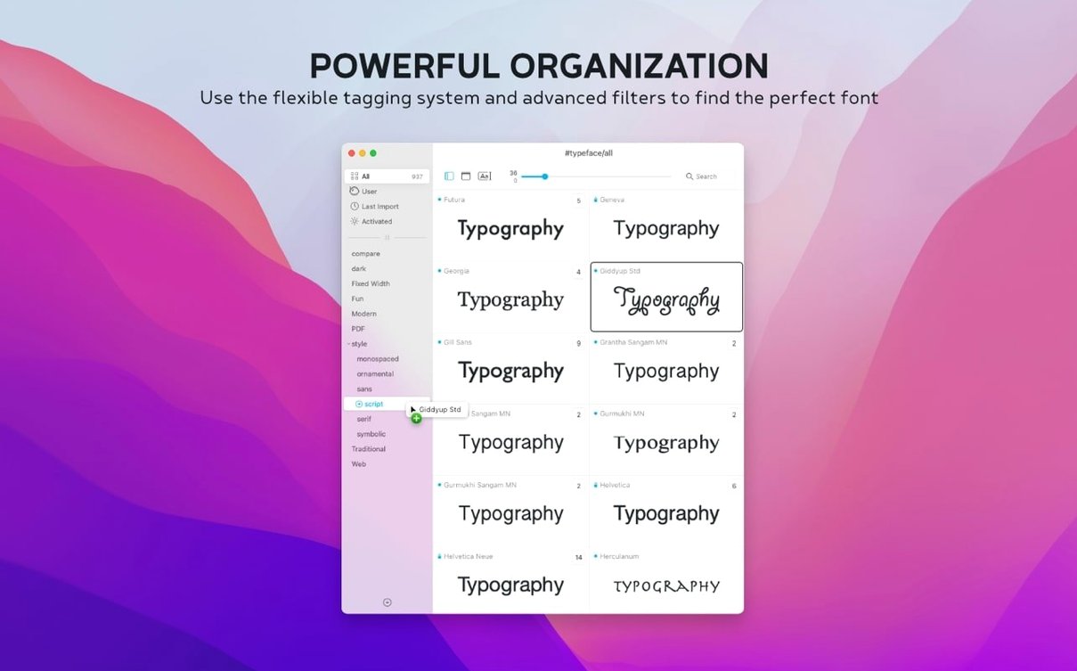
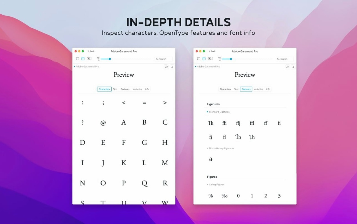
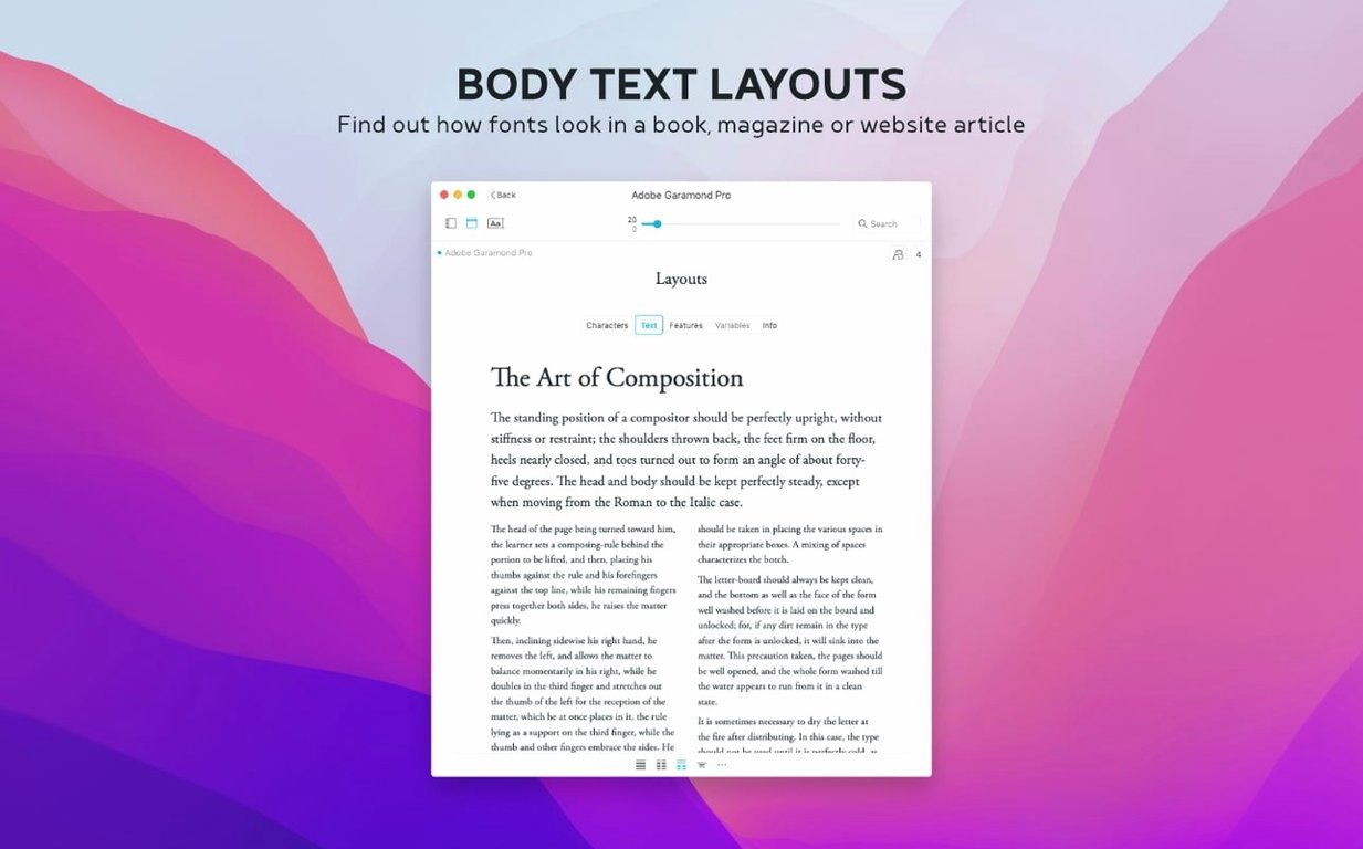
The Last Activated column, added in version 4.5, quietly changes how you retrace your steps through a long browsing session. A few definition lines for the tools an experienced user will care about:
Glyph overview — the full character set displayed in one grid: uppercase, lowercase, numerals, punctuation and special characters. Useful for spotting how a typeface handles the ampersand or the weight of its diacritics before you commit.
Tags — a font can belong to more than one group because a single classification is rarely enough. A condensed sans-serif might sit under editorial and interface simultaneously, without duplicating files.
Notes field — new in this release and searchable across the overview. You might record pairing suggestions, client usage or quirks in hinting — the kind of knowledge that fades between projects.
Collections — custom groupings for installed and uninstalled fonts alike. A collection can hold candidates for a book design alongside backup choices, all visible without activating everything.
Preview controls let you adjust size, sample text and weight independently, so comparisons stay precise. The app reads installed Mac fonts and custom libraries, supports .otc files as of this update, and runs natively on Apple Silicon and Intel machines under macOS 12 or later.
A short workflow: pairing a text face with a display companion
A recent packaging brief called for a serif text font that could handle dense ingredient lists, paired with a condensed sans for the front label. With several hundred options in the library, side-by-side comparison was the only practical route.
I started by narrowing the serif candidates to four text faces already tagged editorial and small-print. All four were dragged into a collection called Packaging shortlist, then opened in the comparison grid. The sample text was set to the actual ingredient copy — 84 words of legal text — at 9 pt. Two faces fell away immediately: one with x-height too low for legibility at that size, another with numerals too wide for the narrow column.
With the text face chosen, I switched to the sans-serif library and filtered by the condensed tag. Three candidates went into the same collection, this time previewed against the short label copy at 18 pt. The side-by-side panel revealed that one sans had a descender depth that clashed rhythmically with the serif beneath it — invisible in isolation, obvious in the paired view. A second candidate, tested in the glyph overview, showed a two-storey ‘a’ that felt too warm for the cool packaging brief. The third worked. Both fonts were tagged packaging, a custom tag, and saved to the client collection with a note: “Approved pair. Do not substitute the sans weight.”
Search reaches notes and old annotations: not just font names
A few details reveal themselves only after daily use. The search field scans notes in addition to font names and tags: typing “italics pairing” or “client X” surfaces fonts annotated months ago, which is faster than re-reading every Info tab. Sorting by the Last Activated column turns the overview into a chronological breadcrumb trail — useful when you remember looking at something three hours ago but cannot recall the name.
Keyboard navigation through the font list is responsive; the arrow keys move through families without delay, and the Return key opens a detailed preview. The weight slider in the preview panel accepts small increments, so testing a medium against a semibold feels precise rather than approximate. And the glyph grid can be copied character by character — right-click an unusual swash or symbol, and it transfers directly into a layout document.
First days: building a usable library
After installing, the application scans the system font folders and presents everything in a flat list. The immediate impulse is to start tagging, but a better first step is to import Google Fonts from the built-in catalogue. The import command brings in more than 2,000 families without touching a browser, and the download is surprisingly measured — the app fetches in batches, and you can pause mid-import if needed.
A practical sequence for the first afternoon:
- Import the Google Fonts library through the File menu, then walk away for ten minutes.
- Create three or four collections that mirror your actual project types — book interiors, web headings, brand identities — rather than abstract categories.
- Drag a handful of known, trusted workhorses into each collection as anchors. These become your baseline against which new discoveries are compared.
- Begin tagging fonts that serve multiple purposes: a workhorse serif might get body, print and client-x tags simultaneously.
- Write notes immediately. The knowledge that a typeface performs poorly below 8 pt or that its licence restricts embedding is easy to forget when a deadline returns six months later.
If you are bringing in fonts from other managers or from downloaded Typeface torrent collections — and many designers do — the .otc support added in this release simplifies the process. Files that previously required extraction or conversion now import directly, and the metadata parsing for .otc families has been reliable in my use: all weights appear under a single family entry, correctly ordered.
Under 3-second launch with 3,400 fonts: stays smooth while scrolling
The application launches in under three seconds on an M1 machine with a library of roughly 3,400 fonts, and scrolling through the full list remains smooth even with the preview panel open. Memory usage during normal browsing sits around 180 MB — modest enough that it never competes with a running layout application. During the Google Fonts import, CPU usage spikes briefly as each family is downloaded and indexed, but the interface stays responsive; you can continue tagging or previewing while the import runs in the background.
On an older Intel machine running macOS 12, launch time stretches to about five seconds, and rapid scrolling through the glyph grid can show a faint lag with very large character sets. The comparison view, however, remains fluid on both architectures. I have not encountered a crash in several weeks of daily use, including sessions where fonts were activated, deactivated and re-tagged repeatedly while layout software was open simultaneously. The auto-save behaviour for collections and tags is unobtrusive: changes persist without dialogue boxes, and quitting unexpectedly during a tagging session preserved the state on relaunch.
The application does not attempt to manage font activation at the system level — it shows installed fonts and allows you to browse uninstalled ones, but it leaves activation to the operating system. This keeps its footprint light and avoids the font cache conflicts that some deeper system-level managers introduce after macOS updates.




Correspondence 0
Take a chair or join the table to send a letter.
No correspondence on this note yet. Letters are read before they appear.